
Social media
How to Use Automation to Save Time and Grow Your Business
How to Use Automation to Save Time and Grow Your Business In a world where time is one of the most valuable resources, automation has

How to Use Automation to Save Time and Grow Your Business In a world where time is one of the most valuable resources, automation has

How a Website Can Boost Your Sales and Grow Your Brand In today’s digital age, having a website is no longer a luxury—it’s a necessity
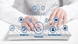
Business Process Automation: Enhancing Efficiency and Reducing Costs In today’s digital age, businesses are facing increasing pressure to improve operational efficiency and reduce costs. A

Los Beneficios del Marketing de Contenidos para Tu Negocio El marketing de contenidos se ha convertido en una estrategia fundamental para las empresas que buscan

La importancia de tener un sitio web compatible con dispositivos móviles En la era digital actual, el acceso a Internet a través de dispositivos móviles

5 consejos de Gotta Web Design LLC para crear una presencia en línea exitosa para tu negocio En el mundo digital actual, establecer una presencia

Por qué Gotta Web Design LLC es tu aliado para alcanzar tus objetivos en línea En el mundo empresarial actual, contar con una presencia en

How to Achieve a Successful Digital Presence for Your Business? In today’s digital age, establishing a strong online presence is crucial for the success of

Best Practices For UX/UI Design In Website Development The UX/UI design can be considered the critical element for website development. UX/UI design is essential for
Common Mistakes To Avoid In Website Development Did you know that 75% of website credibility comes from the website design itself? In today’s digital age,

The Importance Of Responsive Design In Website Development With the increase in the use of smartphones and tablets, responsive web design has become essential to

The Pros And Cons Of Custom Website Development Vs. Website Templates Do you know that according to Forbes, a website can significantly improve the credibility

Be on Your Way to Building A Credible Portfolio In today’s digital marketing age, with many options to choose from, clients generally tend to make

Tips For Climbing Up The Ladder Of Internet Marketing Through Personal Branding Did you know in 2021, the global influencer market was estimated to be

Essential Ad & SEO Lingo Every Website Owner Should Know Ad and SEO lingo is a set of technical terms used to define, optimize, and

Tips For a Faster Website To increase the engagement rate on your profile and reduce the bounce rate, the website must load quickly. It increases

How To Design The Perfect Homepage For Your E-Commerce Store Do you want to make an impactful first impression on your customers and draw them

Why is SEO Crucial for Your Website? SEO, or Search Engine Optimization, is a digital marketing tool that is commonly being used by businesses these

The Importance of An Effective Website With the advent of technology in today’s era, you must work thoroughly on your website design, as it can

How Your Website And Mobile Load Speed Affect Ranking On Google If your digital marketing efforts aren’t taking flight and your website is still behind